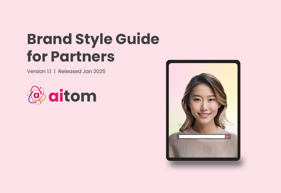
Aitom Unveils Refreshed Logo and Comprehensive Style Guide
March 5, 2025
We're thrilled to introduce the next chapter of Aitom's brand evolution: a refreshed logo and a newly developed style guide that reflect our continued commitment to clarity, intelligence, and human-centered technology.
A Refreshed Logo for a New Era Our updated logo features cleaner lines, a refined design, and a modernized color palette—enhancing recognition and appeal across all platforms. At the heart of this visual identity remains the iconic atom symbol, representing the building block of matter and now, the foundation of AI Agents shaping the future of business. It offers instant clarity and recognition, reinforcing our mission to be the core of AI transformation in the workforce.
Introducing the Aitom Style Guide Alongside our new logo, we're launching a comprehensive style guide that defines how we express our brand, connect with our community, and communicate across every channel. Rooted in our communication philosophy of clarity, intelligence, and innovation, this guide ensures consistency in all touchpoints.
Key Elements of the Style Guide:
Logo Placement: Guidelines to ensure precise and consistent representation
Color Palette: A carefully curated range that conveys our brand essence
Typography: Chosen for optimal readability and harmony
By aligning our visual and verbal communication, we're strengthening trust and deepening engagement with our audience. This unified brand identity marks an exciting milestone as we continue to grow and lead in AI innovation.
Stay tuned as we continue to evolve and grow together.